35 Dumb, Misleading, Or Inappropriate Designs That Businesses Clearly Did Not Think Through At All

1.
This restaurant’s interior design that accidentally insults the food:
2.
This confusing MEN’s bathroom sign:
3.
This sign that gives people mixed signals:
4.
This fire department’s sign that won’t help anyone be safer:
5.
This building’s really weird elevator button system:
6.
This business’s sign that was supposed to be read as “block”:
7.
This bathroom sign that seems like some unsolvable riddle:
8.
These package labels that are setting people up for failure:
9.
This gardening nutrient bottle that looks more like a ketchup bottle:
10.
This apartment complex’s confusing design for the number 2:
11.
This misleading hand sanitzer design:
12.
This tool kit label design that doesn’t look like the world “tools”:
13.
This home decor that says “beach”…kinda:
14.
This spelling mistake in a children’s learning game:
15.
This doctor office’s tiny, vague sign that doesn’t make it clear what kind of business they are:
16.
This “magic of art” sign that looks more like “magic fart”:
17.
This odd logo that honestly compliments the name:
18.
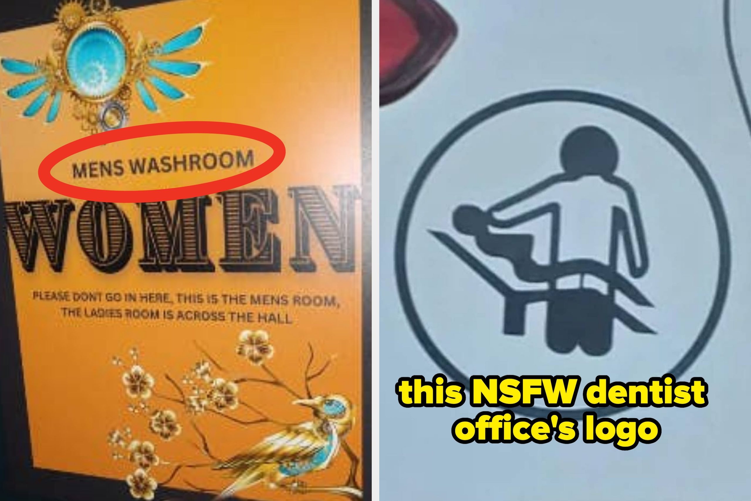
This logo for a dentist’s office that doesn’t look like dentistry:
19.
This confusing logo at a chicken shop of a chicken holding a music note:
20.
The wording of this logo for building erection:
21.
This movie theater logo that doesn’t look so much like a movie seat:
22.
This sign with directions that couldn’t have been executed any worse:
23.
This shockingly explicit restaurant logo:
24.
This off-putting logo for a bakery:
25.
This decorative sign that actually says “eat”:
26.
This hideous, unreadable daycare center sign:
27.
This traffic sign that looks like it’s telling people to follow others home:
28.
This logo that looks like a dog-human hybrid:
29.
This logo for a singing tavern that looks like people being killed:
30.
This double-sided exit sign:
31.
This bathroom sign that desperately needs some rewording or punctuation:
32.
This sign that needs to be WAY bigger so people could see it before they make a mistake:
33.
This business center’s logo that looks like someone sitting on the toilet:
34.
This logo for coconut water that’s actually the chemical equation for dicarbon monoxide:
35.
And finally, this sign that reads like it insults certain employees:
Want more funny, weird, wholesome, or just plain interesting internet content like what you just read? Subscribe to the Only Good Internet newsletter to get all of the scrolling with none of the doom. No politics, no celeb drama, just Good Content.